Copyright © 2026
Rashid Visda. All rights reserved.
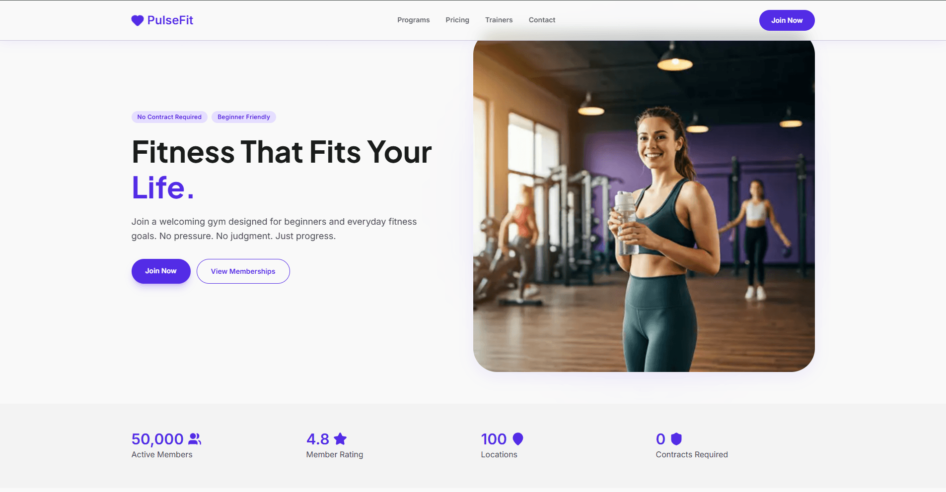
A modern, responsive gym landing page built with Next.js, Tailwind CSS, and Motion. This project focuses on performance, clean UI design, and smooth scroll-based animations to create a premium fitness brand experience.
lucide-react motion nextjs react tailwindcss
Pulse Fit
A modern fitness website built with Next.js, React, and TypeScript. The site showcases gym programs, pricing, trainers, and services with smooth animations and optimized performance.
View Live Demo
Table of Contents
Features
Server-Side Rendering : Optimized Next.js configuration for fast page loads and SEOSmooth Animations : Fade-in effects and motion components for visual polishResponsive Design : Tailwind CSS for mobile-first responsive layoutsTypeScript : Full type safety throughout the codebasePerformance Optimized : Code splitting with dynamic imports, image optimizationComponent Architecture : Reusable modular components for easy maintenance
Tech Stack
Framework : Next.js 16 with React 19Language : TypeScriptStyling : Tailwind CSS 4 Animations : Motion for smooth transitionsIcons : Lucide React PostCSS : CSS processing and transformationLinting : ESLint with Next.js config
Getting Started
Prerequisites
Ensure you have the following installed:
Node.js 18.17 or later
npm or yarn package manager
typescript
Installation git clone <repository-url>
cd pulse-fit
Running the Development Server Start the development server:
The page auto-updates as you edit files. The application uses hot module replacement (HMR) for instant feedback during development.
Building for Production Create an optimized production build:
The build process compiles TypeScript, optimizes components, and prepares assets for deployment.
Project Structure pulse-fit/
├── app/ # Next.js app directory
│ ├── layout.tsx # Root layout with navbar and footer
│ ├── page.tsx # Homepage with main sections
│ └── globals.css # Global styles
├── components/
│ ├── FadeIn.tsx # Fade-in animation wrapper
│ ├── PageIntro.tsx # Intro section wrapper
│ ├── layouts/
│ │ ├── Navbar.tsx # Navigation header
│ │ └── Footer.tsx # Site footer
│ └── sections/ # Homepage sections
│ ├── Hero.tsx # Hero banner
│ ├── Stats.tsx # Statistics display
│ ├── Whyus.tsx # Features/benefits section
│ ├── Programs.tsx # Workout programs
│ ├── Pricing.tsx # Pricing tiers
│ ├── Trainers.tsx # Team trainers
│ ├── AppSection.tsx # App promotion section
│ └── CTA.tsx # Call-to-action
├── data/ # Static data files
│ ├── hero.ts
│ ├── stats.ts
│ ├── programs.ts
│ ├── pricing.ts
│ ├── trainers.ts
│ ├── features.ts
│ ├── nav.ts
│ └── footer.ts
├── public/ # Static assets
├── next.config.ts # Next.js configuration
├── tailwind.config.mjs # Tailwind CSS configuration
├── tsconfig.json # TypeScript configuration
└── package.json # Project dependencies
Configuration
Environment Variables Create a .env.local file in the root directory for local environment variables (if needed):
Next.js Configuration The next.config.ts file includes configuration for remote image optimization from:
lh3.googleusercontent.com (Google CDN)images.unsplash.com (Unsplash) To add more image sources, update the remotePatterns array in next.config.ts.
Tailwind CSS Tailwind CSS 4 is configured with PostCSS. Customize your design system in tailwind.config.mjs:
export default {
theme : {
extend : {
colors : {
},
},
},
};
Data Management Static content is managed through TypeScript files in the data/ directory. Each file exports typed data:
export const programs = [
{
id : 1 ,
title : "Program Name" ,
description : "Program details" ,
},
];
Development
Available Scripts
npm run dev - Start development server with hot reloadnpm run build - Build for productionnpm start - Start production server (requires npm run build first)npm run lint - Run ESLint to check code quality
Creating Components New components should follow the existing patterns:
Functional Components : Use arrow functions with TypeScript typesClient Components : Add "use client" directive for interactive featuresStyling : Use Tailwind CSS utility classesAnimations : Use Motion hooks for animations (see FadeIn.tsx for reference) "use client" ;
import { ComponentProps } from "react" ;
interface MyComponentProps {
title : string ;
description : string ;
}
export function MyComponent ({ title, description }: MyComponentProps ) {
return (
<div className ="p-4" >
<h2 className ="text-2xl font-bold" > {title}</h2 >
<p className ="text-gray-600" > {description}</p >
</div >
Styling Guidelines
Use Tailwind CSS utility classes
Keep component styles within the component file
Use the configured fonts: Plus Jakarta Sans (primary) and Inter (secondary)
Follow mobile-first responsive design approach
Code Quality Run the linter to check for code issues:
The project uses ESLint with Next.js recommended rules. Fix issues automatically when possible:
Contributing Contributions are welcome. To contribute:
Fork the repository
Create a feature branch (git checkout -b feature/amazing-feature)
Commit your changes (git commit -m 'Add amazing feature')
Push to the branch (git push origin feature/amazing-feature)
Open a Pull Request
Code follows the project's ESLint rules
Components are properly typed with TypeScript
Styles use Tailwind CSS utilities
Changes are tested in the development server
License This project is licensed under the MIT License - see the LICENSE file for details.
Support For issues, questions, or suggestions, please open an issue in the repository or contact the maintainers.